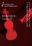
OAE Released: Cover art
Through the history of recorded music the cover artwork on a CD or LP has always been an important part of the finished product, and in the pop world in particular, there are have been some truly legendary and iconic designs – just think of Abbey Road, The Dark Side of the Moon, Sgt. Pepper and Nirvana’s Nevermind. The fact I don’t feel a need to post pictures of these to remind readers is a testament to the way their cover art has entered the popular conciousness.
It has to be said though that classical music hasn’t done so well with its cover art (though do feel free to tell us about any of your favourite covers) and it’s probably easier to find some really bad cover art than anything really distinctive. There are some exceptions of course (two of my favourites being the Virgin Ultraviolet range and Decca’s Argo line, both now out of print, and some more in this blog article) but they are the exception and not the rule.
So when we came to produce the first CD on our OAE Released label we wanted to think long and hard about the artwork. We tasked the designers, Harrison and Co, with coming up with something that would be very ‘OAE’ – distinctive, different, something that would stand out from other CDs and tie in with the Orchestra’s values. Importantly the artwork would need to be a distinctive series – so that while each CD would look different they should also be recognisably from the same stable.
The designers came back with a range of options and there were two frontrunners for us, but we ultimately went with an alphabet theme…in the video below designer Chris talks through the different options he came up with, including the one we eventually picked.
The first CD on OAE Released, Monteverdi’s 1610 Vespers is out now and can be bought through our website.
William Norris, Communications Director


